Get the Influencer Look
Many of us are now heading to social media for inspiration when it comes to decorating our homes - scrolling through and lusting over our dream houses.
To help make these swoon worthy interior schemes a reality, Valspar has looked at the paint colours being tagged in users’ homes throughout the year to identify its top three ‘Instagrammable’ shades.
Dark blues
How to style...
Offset clashing colours such as emerald greens and royal blues with blush and nude interiors to create a modern, but luxurious look
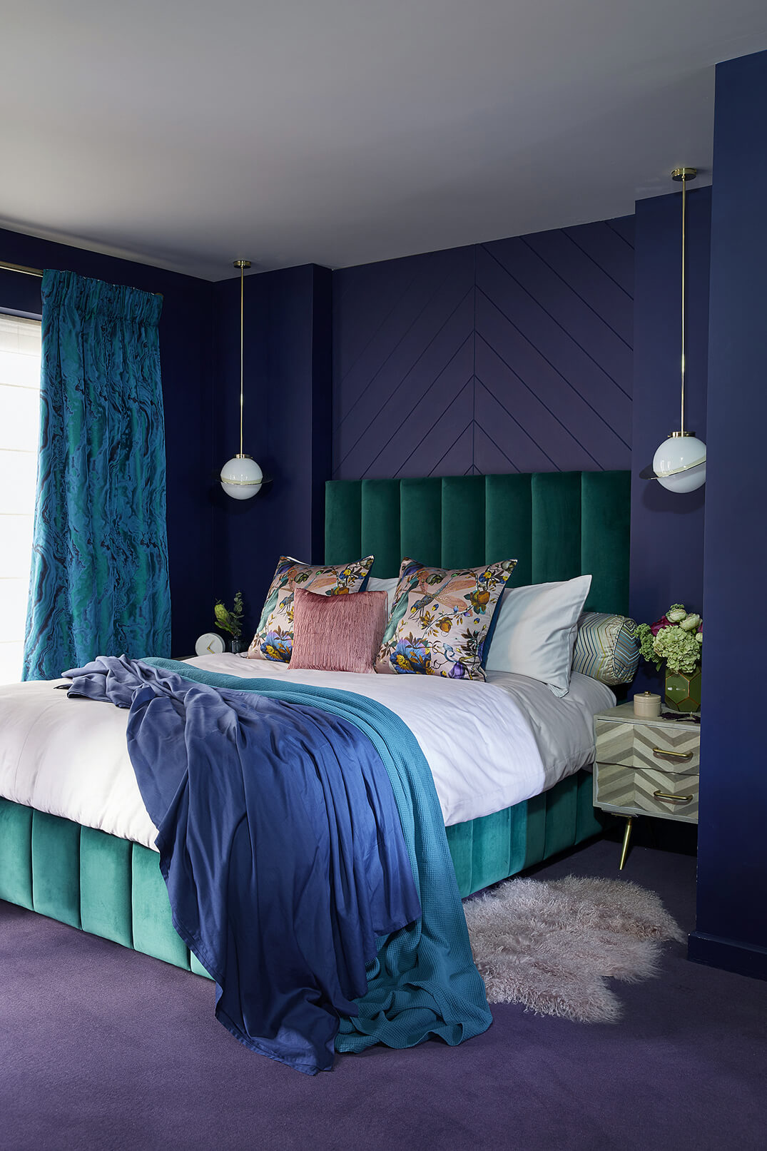
Tuxedo Blue
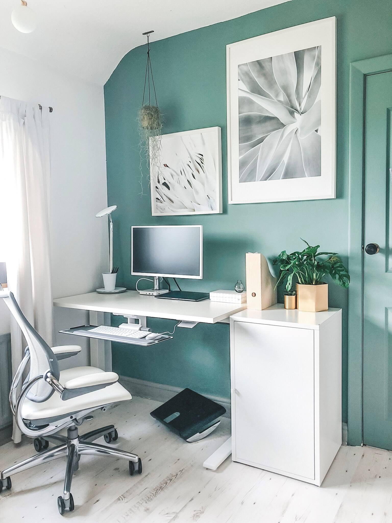
W30dSage
How to style...
Go bold with your neutrals by choosing sage shades and style with cream tones and wood to allow this soft greens to bring warmth into your home.

Shadowed Ivy
R271CPinks
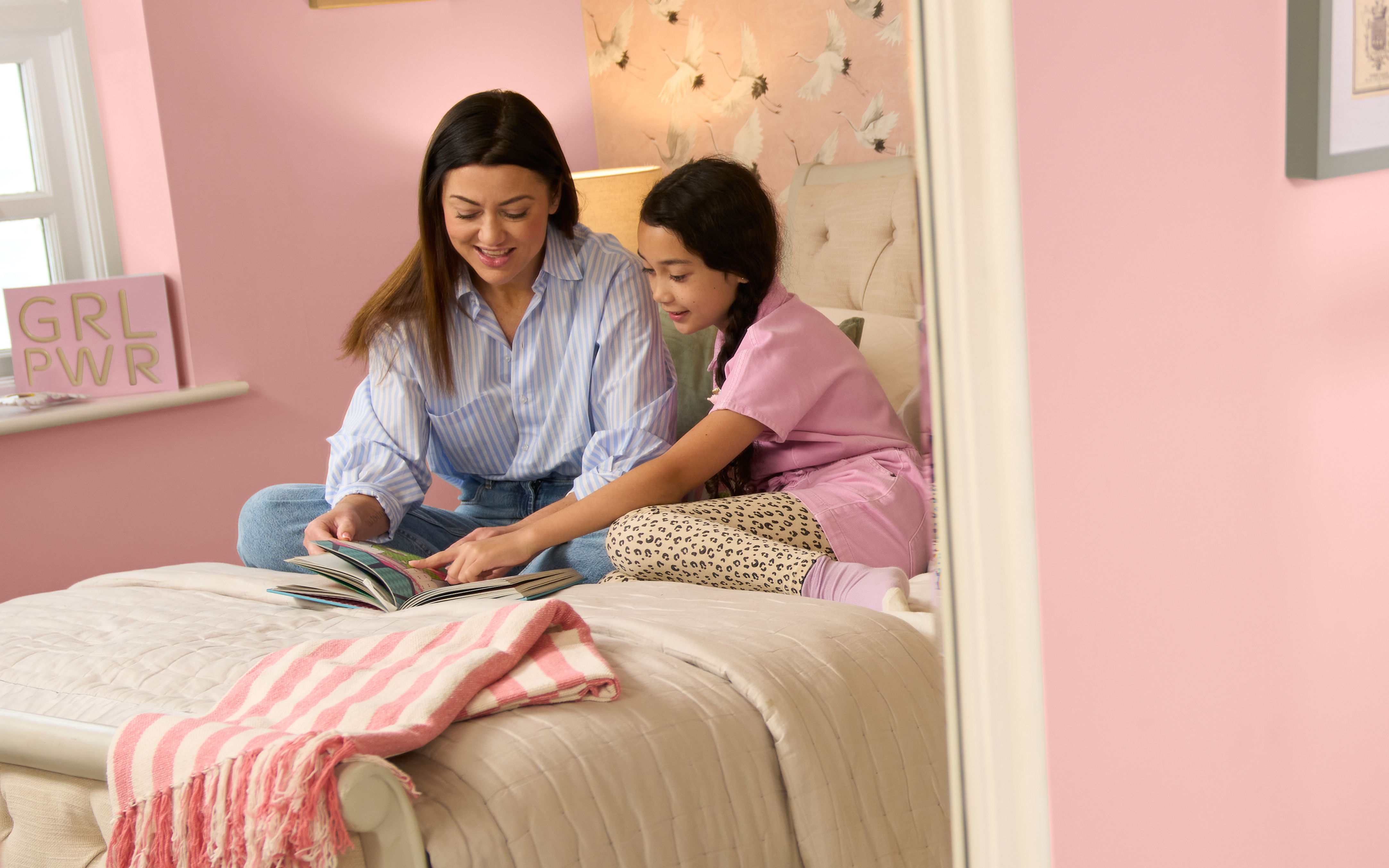
How to style...
Pairing pale and bright pinks with greenery provides an eye-catching contrast that breathes life into living spaces and will look great on the grid.
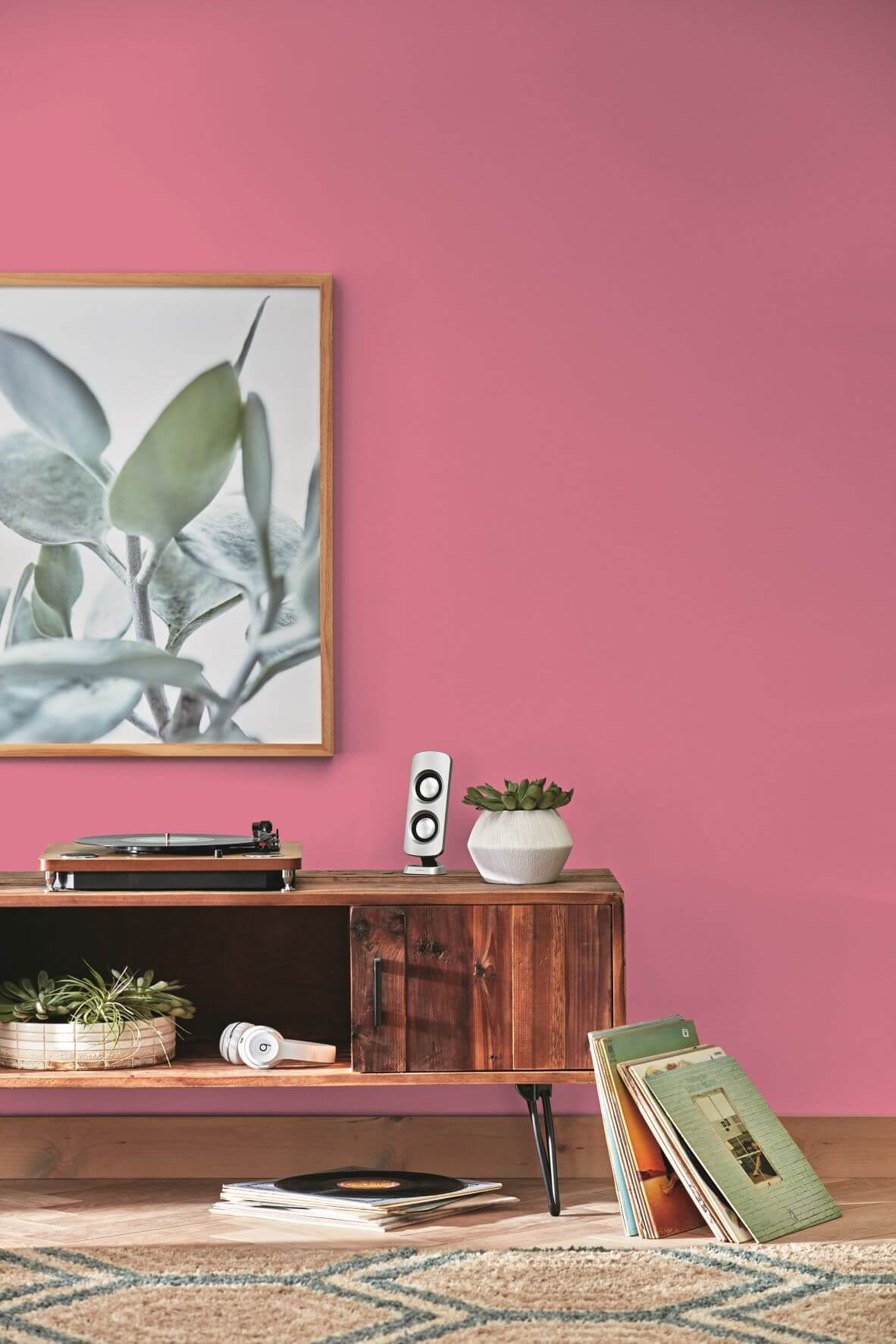
Sue Kim Senior colour designer at Valspar, gives her top tips on how to style them: “Topping the charts, pink is definitely here to stay with bright shades becoming increasingly popular, especially in living spaces when paired with botanical prints. Next up, we’ve seen that calming sage shades remain on-trend as we look to use brighter and livelier neutrals in our homes. Beautifully styled navy and dark green shades are also making an appearance in bedrooms, such as this rich ‘Tuxedo Blue W30D’, creating a decadent sanctuary.”


