CONSIDERING COLOUR PSYCHOLOGY WHEN ON THE JOB
There’s more to colour than it just being nice to look at. In fact, it can significantly influence your mood, energy and wellbeing. With this in mind, understanding room colour psychology can help you talk to customers about their desired interior scheme and give the best recommendations. Read on, as we give you the lowdown…
The look and feel of a room, and how people feel within it, can be massively impacted by the colours chosen. When consulting with a customer on their project, having the ability to create personalised colour schemes based on the room’s function could help put you ahead of the competition.
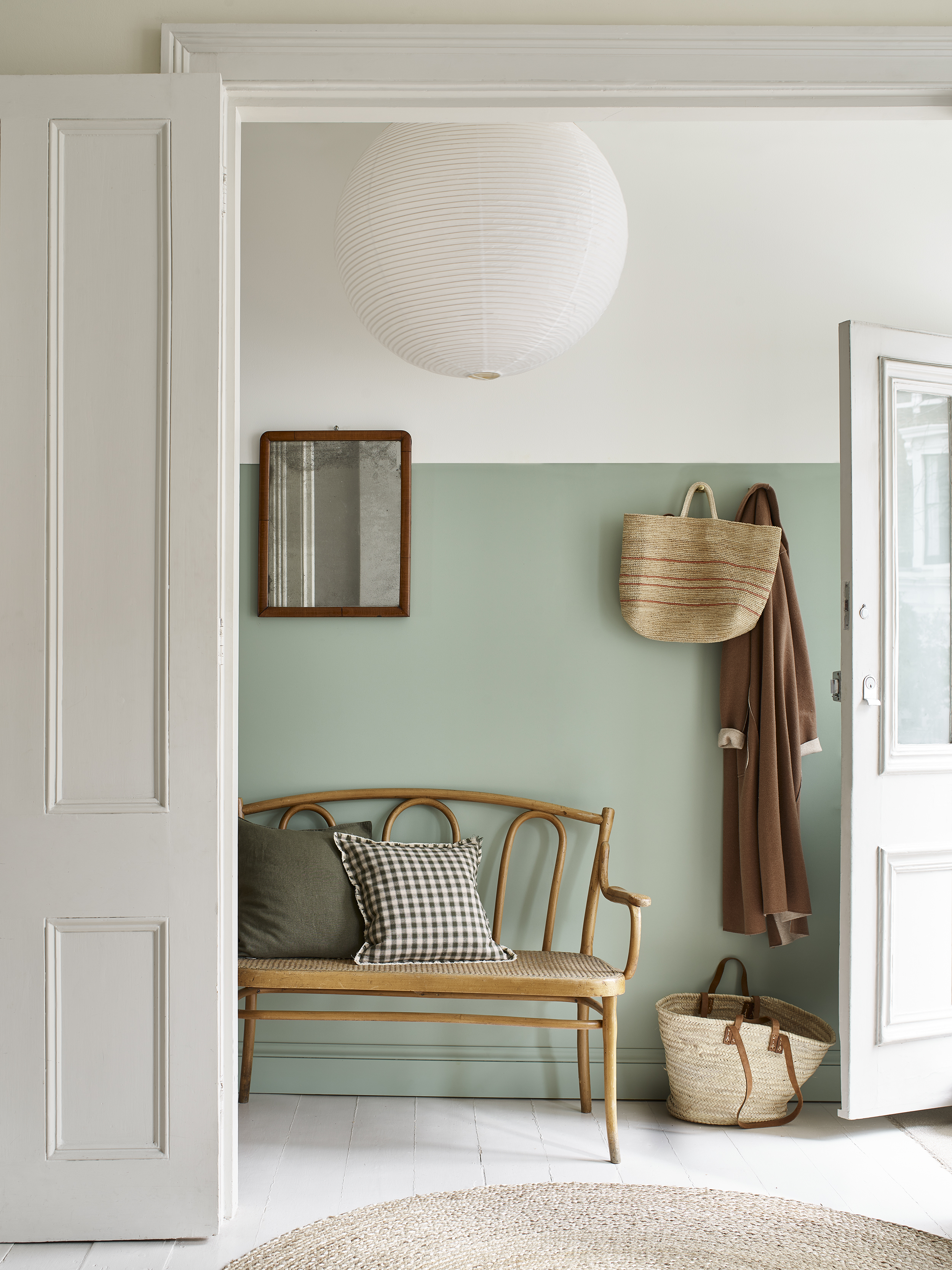
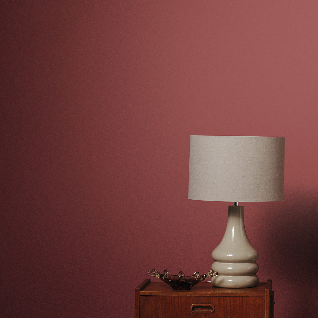
Colours can generally be separated into two categories: warm and cool. Warm tones are typically used for a welcoming and cosy interior, while cool shades (such as greens, blues and purples) can create a calmer environment. Additionally, each colour in these two groups can also provide different feelings within a space.
For example, red stimulates energy and passion, green invites creativity and calm, yellow brings optimism and can activate memory, while blue inspires wisdom and hope. However, this is not an exact science, as people can have different reactions to colour or base their choices purely on personal preference.

One of the first considerations should be the purpose and size of the room. It may seem obvious, but a colour that works well for a living room may not work well in a bedroom or bathroom. For instance, in a bedroom, a darker colour can help aid sleep, but in small rooms it can produce a feeling of claustrophobia. Similarly, north facing rooms that typically receive less daylight can benefit from warmer tones, which can act as mood boosters in popular living areas, such as living rooms and kitchens.
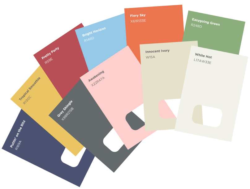
Once the customer has chosen a tone, you can then delve into colour scheming, which will present a range of options to pair alongside their initial choice. Fan decks and colour wheels are a useful tool for this, giving multiple options to choose from:
- A single colour in a range of tints, shades and tones
- Complimentary colours on opposite sides of the colour wheel
- A harmonious scheme, using three neighbouring colours to create a natural flow
- A high-impact interior, which uses three colours from the colour wheel that form a triangle to achieve a bold look
At Valspar Trade, we understand the importance of colour, which is why we promise the perfect match every time. As well as 2,000 pre-selected colours, our colour matching service can help your customer to find the perfect match for their rooms, with a database of over 2.2 million shades. All our Valspar Trade paints can be tinted in TradePoint stores across the UK, using best-in-class tinting machines, shakers and colour spectrometers.
For more information on Valspar Trade’s colour matching service click here.


